Plotly
The aim of this tutorial is to understand how to build Plotly graphics in RPGM using the widgets graph. The widget graph is designed to receive an R variable (a list) that represents the plotly chart.
How does it work? RPGM directly includes Plotly natively from Javascript. It takes the same arguments as the javascript version but as an R list. Don't worry, you will not need to learn anything about javascript, it is actually very simple, let's start with an example!
Create a new project with the File menu -> New project..., select RPGM project, and name our new project "ChartsWithPlotly".
A first graph
We begin with a simple line chart. We take the example given by the Plotly help and then adapt it to provide a custom chart with a random walk.
Create a GUI file named graph.pgui, and add it to your sequencer. In the GUI file, add the following widgets:
- A Label (that you can customize),
- A Graph.
In the widget Graph, fill the field Graph variable with mygraph. It is the name of a Graph variable that we will create. Create an R script named engine.R and add it to the sequencer before the GUI step.
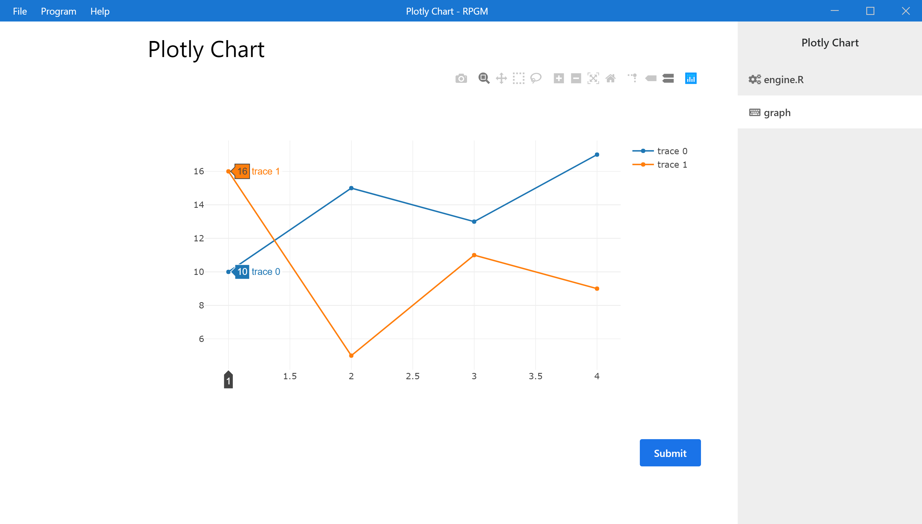
We will display a simple line chart with Plotly. In the Javascript help at https://plot.ly/javascript/line-charts/, we have the following code in Javascript:
var trace1 = {
    x: [1, 2, 3, 4],
    y: [10, 15, 13, 17],
    type: 'scatter'
};

var trace2 = {
    x: [1, 2, 3, 4],
    y: [16, 5, 11, 9],
    type: 'scatter'
};

var data = [trace1, trace2];

Plotly.newPlot('myDiv', data);
In RPGM, we need to recreate the variable data in the same way, using R lists (and, if possible, we can also use R vectors). In particular, trace1 will be a list that contains:
- an
xcomponent, which can be either a list or a vector, - a
ycomponent, which can be either a list or a vector, - a
typecomponent, which is a simple character's string that gives the style of the line.
We do the same with trace2 and we create a list with trace1 and trace2 which is our data variable. Finally, we create the mygraph variable as a list with data. To sum up, to display this example, our script in engine.R is:
trace1 = list(                      # var trace1 = {
    x = c(1, 2, 3, 4),              #   x: [1, 2, 3, 4],
    y = c(10, 15, 13, 17),          #   y: [10, 15, 13, 17],
    type = 'scatter'                #   type: 'scatter'
)                                   # };

trace2 = list(                      # var trace2 = {
    x = c(1, 2, 3, 4),              #   x: [1, 2, 3, 4],
    y = c(16, 5, 11, 9),            #   y: [16, 5, 11, 9],
    type = 'scatter'                #   type: 'scatter'
)                                   # };

data = list(trace1, trace2)         # var data = [trace1, trace2];

mygraph <- list(data = data)        # Plotly.newPlot('myDiv', data);
Note that, the graph variable is a list that contains a member data witch is the name of the variable in the Plotly example. See clearly the analogy between the Javascript version (in comment above on the right) and the RPGM version (the R code on the left). It always works in the same way! Save and test the program with F5.

Place your own data
Now, we customize our graph. We will display two paths of a random walk.
The following function simulates such a random sequence:
Then, we adapt the code of engine.R in order to provide two paths of the random walk with n = 100 simulations.
RW <- function(n)
    return(cumsum(1-2*rbinom(n, 1, 0.5)))
n <- 100
trace1 = list(
x = 1:n,
y = RW(n),
type = 'scatter'
)
trace2 = list(
x = 1:n,
y = RW(n),
type = 'scatter'
)
data = list(trace1, trace2)
mygraph <- list(data = data)
Press the F5 key to execute the program.

Update dynamically the graph
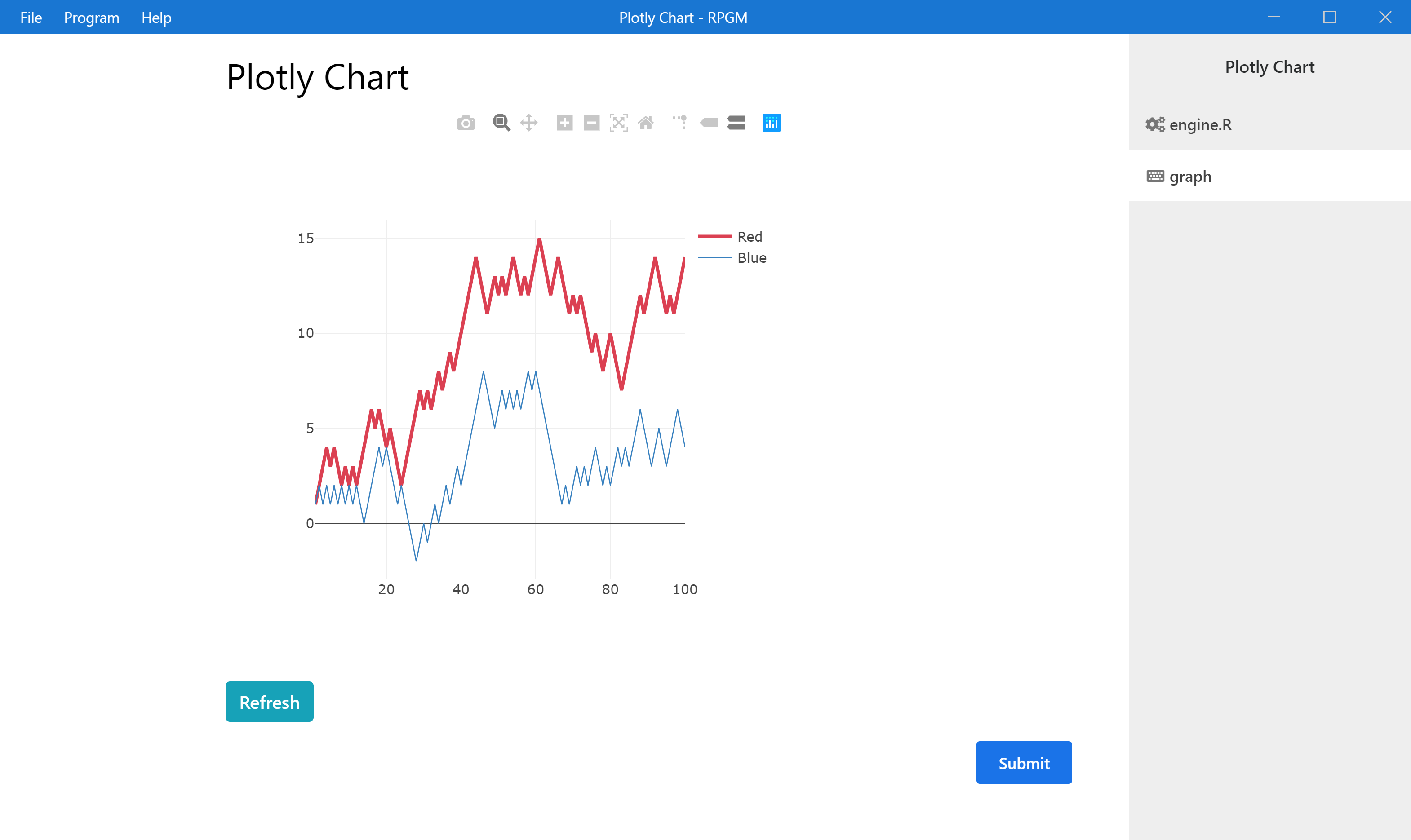
Since the paths are random, we can generate them several times. We now add a button in order to resimulate the paths and to refresh the chart. In the graph.pgui file:
- in the widget Graph, add an ID. For example, fill the ID field with
graphRW. This is important, since we will update the chart dynamically using the ID. - add a Button widget. Fill the field Value of the button with
Refreshand fill the field R when pressed withupdategraph(100).updategraphis a function which regenerates the graph and that we define in engine.R (see the code below).
The entire R file is:
RW <- function(n)
    return(cumsum(1-2*rbinom(n, 1, 0.5)))

n <- 100

generategraph <- function(n)
{
    trace1 = list(
        x = 1:n,
        y = RW(n),
        type = 'scatter'
    )

    trace2 = list(
        x = 1:n,
        y = RW(n),
        type = 'scatter'
    )

    data = list(trace1, trace2)

    return(list(data = data))
}

mygraph <- generategraph(n)

updategraph <- function(n)
{
    mygraph <<- generategraph(n)
    gui.update("this", "graphRW")
}
Note
The updategraph function first modifies the variable mygraph, which is called in the Graph variable field of the widget graphRW. We modify it globally (outside of the function) with <<- and then ask to update the graph with gui.update(step, id) which refreshes the field Graph variable / Value of the corresponding widget.
Save and push F5 to execute your program. You can now refresh the graph with two new random paths each time you push your Refresh button.
Styling the graph
We would like to customize the style of our graph, using more options easily. Look at the Styling Line Plot section for the javascript code, which is
trace1 = {
    type: 'scatter',
    x: [1, 2, 3, 4],
    y: [10, 15, 13, 17],
    mode: 'lines',
    name: 'Red',
    line: {
        color: 'rgb(219, 64, 82)',
        width: 3
    }
};

trace2 = {
    type: 'scatter',
    x: [1, 2, 3, 4],
    y: [12, 9, 15, 12],
    mode: 'lines',
    name: 'Blue',
    line: {
        color: 'rgb(55, 128, 191)',
        width: 1
    }
};

var layout = {
    width: 500,
    height: 500
};

var data = [trace1, trace2];

Plotly.newPlot('myDiv', data, layout);
- There are more options in
trace1andtrace2, we just need to add them in the R code, - The particular option
linewill be a list, - We have there a layout, that we will add to the final graph variable.
The adapted R code for the function generategraph, using the same customization as above, is simply:
generategraph <- function(n)
{
    trace1 = list(
        x = 1:n,
        y = RW(n),
        type = 'scatter',
        mode = 'lines',
        name = 'Red',
        line = list(
            color = 'rgb(219, 64, 82)',
            width = 3
        )
    )

    trace2 = list(
        x = 1:n,
        y = RW(n),
        type = 'scatter',
        mode = 'lines',
        name = 'Blue',
        line = list(
            color = 'rgb(55, 128, 191)',
            width = 1
        )
    )

    layout = list(
        width = 500,
        height = 500
    )

    data = list(trace1, trace2)

    return(list(data = data, layout = layout))
}

Now you can try other Plotly charts, using other parameters or options, even the most complicated ones, it always works in this way.
This ends our tutorial! You can download the program as a pgm file for RPGM here (that you can create with the top menu PGM -> Export as PGM) and as a zip file containing all the project for RCode here.