Widgets
A widget in an atom of a graphical user interface (the .pgui file). All widgets share some common properties.
Main properties
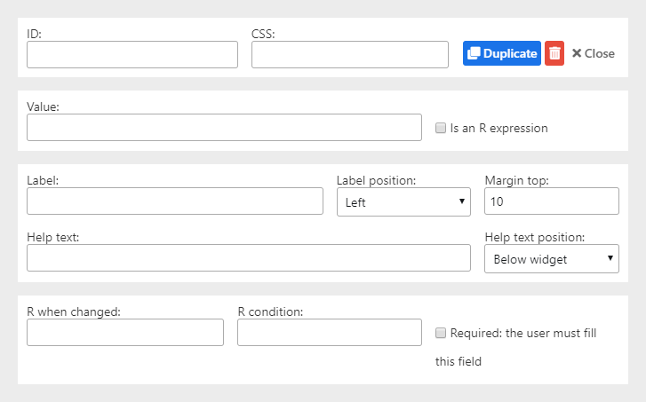
- ID: a unique ID for the widget. If the widget can return a value (like data widgets), an R or Python variable with the same name will be created with the value given by the widget. It is also used for with the dynamism functions such as
gui.setProperties()to identify the widget. - CSS: either a CSS class name as defined in the project.ppro file (CSS section), or some inline CSS properties separated by a semicolon (;), like the HTML
styleattribute. A full tutorial for the use of CSS in RPGM is available here.
- Value: the default value of the widget.
- Is an expression: if the value given is an R or Python expression that has to be evaluated.
- Label: a text displayed on the left (by default) of the widget.
- Label position: where the label is displayed, can be Left (by default), Top, Top aligned or No label. Inside a column widget, it is in general better to choose Top or No label.
- Margin top: distance in pixel from the widget above.
- Help text: a text displayed below the widget (by default).
- Help text position: the position can be Below widget or With label. For With label, a sign (?) appears on the left of the label on which the help appears when the user hovers it.
- Code when changed: A code to execute when the value of the widget changes.
- Code condition: A condition that the value of the widget must satisfied. If empty or if the evalution returns true, it passes the test. Else, the user is blocked until the value is correct. If the evalution returns a
charactervariable from R, it is printed in red below the widget: this is useful for describing the error. - Required: If the widget must be filled.
Tip
The field ID can have all R and Python supported formats variable names, like mylist$name if mylist does exist.
Tip
In Code when changed and Code condition, you can use the ID of other widgets: the associated variables already exist when they are called.
Display Widgets
Display widgets are designed to show something in your application. No variable is created even if the ID field is filled. The ID field allows to modify the widget through a function such as gui.setProperties(). There are four widgets that are explained below.
Label
The Label widget displays a text. It supports HTML.

You can directly set the following properties without HTML/CSS:
- the font size (14 by default) ;
- the color (black by default) ;
- the font family.
Image
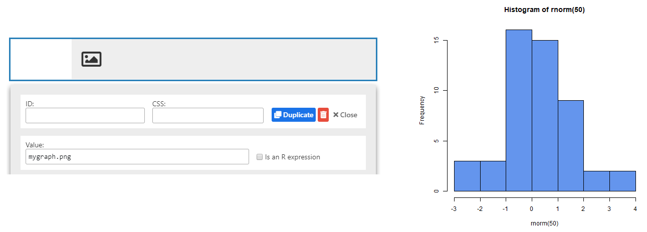
The Image widget displays an image. The field Value is the path of the image, which can be absolute or relative to the program or output directory.
It can be a graphic generated with R or Python, for example with the following code:
To display this graphic, we fill the field Value with mygraph.png.
Tip
To update a graphic with an image dynamically, regenerate the image and then use the function gui.update(). In this case, it requires to fill the ID field of the image widget and to use it in gui.update().
Graph
The Graph widget displays an interactive graph with Plotly. The field Graph variable require a list that represents the graphic. It does not work with the plotly package in R or Python, it is native in RPGM and the syntax is different. It relies on the javascript syntax in plotly.
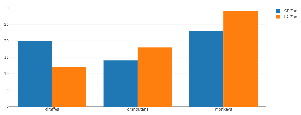
For example, in order to display the example in https://plotly.com/javascript/bar-charts/#grouped-bar-chart, the code should be:
trace1 = list(                                      #var trace1 = {
  x = c('giraffes', 'orangutans', 'monkeys'),       #  x: ['giraffes', 'orangutans', 'monkeys'],
  y = c(20, 14, 23),                                #  y: [20, 14, 23],
  name = 'SF Zoo',                                  #  name: 'SF Zoo',
  type = 'bar'                                      #  type: 'bar'
)                                                   #};

trace2 = list(                                      #var trace2 = {
  x = c('giraffes', 'orangutans', 'monkeys'),       #  x: ['giraffes', 'orangutans', 'monkeys'],
  y = c(12, 18, 29),                                #  y: [12, 18, 29],
  name = 'LA Zoo',                                  #  name: 'LA Zoo',
  type = 'bar'                                      #  type: 'bar'
)                                                   #};

data = list(trace1, trace2)                         #var data = [trace1, trace2];

layout = list(barmod = 'group')                     #var layout = {barmode: 'group'};

mygraph <- list(data = data, layout = layout)       #Plotly.newPlot('myDiv', data, layout);
The graphic is displayed with mygraph in the field Graph variable of the widget Graph.
Tip
A full tutorial for the Graph widget is available here.
Progress Bar
The Progress bar widget displays a colored bar that shows a progression. The field Value takes an integer between 0 and 100.
- Color: The color of the progress bar ;
- Description: The text written in the progress bar.

Tip
If you execute some code inside the GUI which is time consuming, the progress bar is a way to show the current progress.
Data Widgets
Data widgets are designed to get an input from the user and to send it to R or Python. The field ID is required in order to get the variable: its name will be the ID.
Text
The Text widget gets a text (a character variable in R and a string in Python) as an input. It has a two types: Text wich is a one-line input box, and Textarea which is the multiple line version.
Number
The Number widget gets a number (a numeric or integer variable in R) as an Input. It has three types: Numeric, Integer and Slider. Numeric is designed for an R numeric value, whereas Integer is designed for an R integer value. The slider is like the Integer type but, instead of an input box, it provides a slider on which we can choose the value.
There are three specific properties:
- Minimum value: the minimum authorized value ;
- Maximum value: the maximum authorized value ;
- Step between values: for Numeric and Integer type, the step of increase/decrease with the arrows on the right of the widget, and for Slider type, the step used by the slider.
Select
The Select widget gets a (possibly multiple) choice and returns a character vector in R and a string or an array of string in Python. There are four types for this widget:
- Select: a list box in which the user selects one option ;
- Multi-select: a list box area in which the user selects none, one option or several options ;
- Radio: exactly like the Select type but with a radio style ;
- Multi-radio: exactly like the Select type but with a multi checkbox layout.

Tip
If the selection is empty, the widget returns NULL.
The widget has three specific properties:
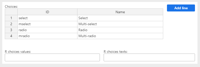
- Choices: a table in which you place the choices. The column ID has the returned values in R whereas the column Name has the texts displayed in the widget ;
- R choices values: a
charactervector from R, if the choices come from R, correspond to the returned values in R ; - R choices texts: a
charactervector from R, if the choices come from R, correspond to the texts displayed in the widget.
Tip
In the table of Choices, an option Remove row is available through a right click on the corresponding line.
Tip
In order to dynamically manipulate the choices, see the functions gui.addChoice, gui.addChoices, gui.removeChoice and gui.clearChoices.
Path
The Path widget gets a path (R character variable) to a file or a folder using an explorer. On RPGM Server, it looks for a file on the server in the user directory. It has two types: File, which selects a file, and folder which selects a folder. This widget is visually like the text widget but with a button for selecting a file or a folder.

Note
You can provide a path to a default file, in order to execute a sample data. For example, fill the field Value with rpgm.pgmFilePath("data_example.csv") (with is an R expression checked) where data_example.csv is a data file at the root of your project.
Date
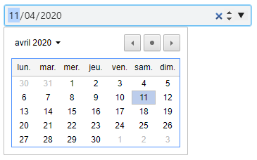
The Date widget returns an R Date. The user can show a calendar with a click on the right of the widget, in which he can select a date.
Grid
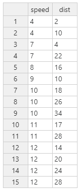
The Grid widget displays a data.frame or matrix as an excel-like spreadsheet and posibly returns an R matrix. The copy/paste from and to Excel works with this widget. The field Value waits an R data.frame or an R matrix. If the ID field is filled, the user can edit the grid and get it in R as a matrix.
The properties of the grid are:
- Data type: the type of the matrix, if the grid is returned to R ;
- Columns names: the column names of the data. If empty, RPGM looks in the data given in Value ;
- Rows names: the row names of the data. If empty, RPGM looks in the data given in Value ;
- Number of columns: the number of columns. If empty, RPGM looks in the data given in Value ;
- Number of rows: the number of rows. If empty, RPGM looks in the data given in Value.
Note
If you update dynamically the grid with huge data, but without needing to get it after as an R variable, you may use set readonly to TRUE with gui.setProperty. In this case, the grid is not transfered to R at each update or on submit and can prevent lags.
Checkbox
The Checkbox widget returns TRUE or FALSE according to its status. It has two types: Checkbox and Switch. The only difference is the display: the first one is the classic checkbox to check when the second one is a button to turn TRUE or FALSE.

Action Widgets
Button
The widget Button executes an R code when pressed. The field Value is the text displayed in the button. The button has three properties:
- R when pressed: the R code executed when the user presses the button (in general, a function call with a function defined beforehand) ;
- Style: the color for the button ;
- Size: the size of the button.

Tip
If Style and Size properties do not give enough options, the button can be customized through the CSS field.
Note
If the execution of the code in Code when pressed is not finished when the user clicks again on the button, the new action is queued. If the execution is time consuming, you can avoid multiple clicks by adding gui.disable("this", "buttonID") at the beginning of the execution and gui.enable("this", "buttonID") at the end, where buttonID is the ID of the button.
R Code Repeater
In construction.
Layout Widgets
Layout widgets are designed to manage the layout of the GUI. There are containers: they contains some other widgets. With the Re-order button, you can move in or out the widgets of a Layout widget, or change the order.
Columns
The Columns widget contains one or several widgets. The first widget corresponds to the first column, the second one to the second column and so on. In order to place several widgets in a single column: add a List widget in the Column widget (which is the case by default) and place the widgets inside the List widget.
You can add or remove the columns and choose their width. The width of each column is an integer and the total width is 12 (the sum cannot go above 12). The List widget inside is a mandatory for a column with several widgets, but for a column with only one widget, it is facultative.
The Padding (10 default) property is the inner marging in pixels between each column.

Note
It is generally better to set the Label position to Top or No label for each widget inside the Columns widget. It is possible to use the Label of the column to name the row or the first item on the left.
Tabs
The Tabs widget contains one or several widgets. The first widget corresponds to the first tab, the second one to the second tab and so on. In order to place several widgets in a single tab: add a List widget in the Tabs widget and place the widgets inside the List widget.
You can add tabs and choose the name. Removing one is done with a right click on the corresponding line. The property Starting tab is the index of the one displayed at the loading.

List
The List widget contains one or several widgets and can apply a box around with a header. It can be customized with CSS.
The two specific properties are:
- Header: a header text and box, if empty, no header is displayed ;
- Style: a default style for the widget.
